The charms of imperfection

floral mandala detail.jpg

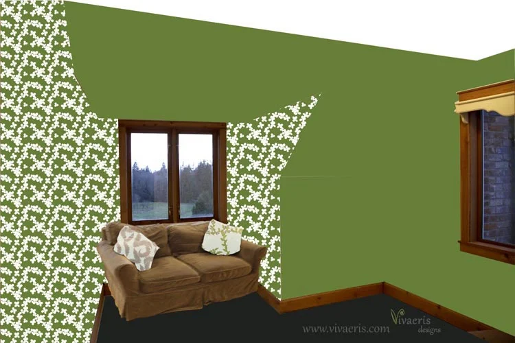
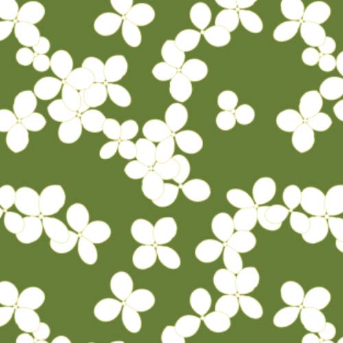
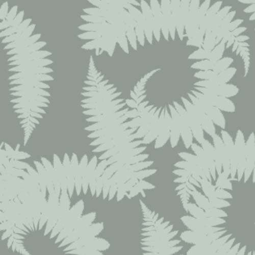
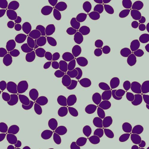
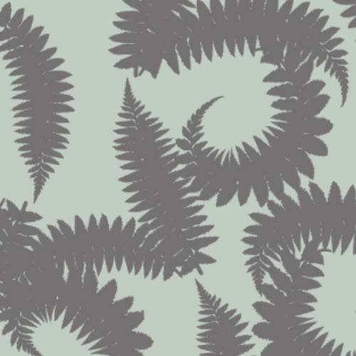
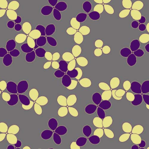
I’ve noticed something interesting as I’ve been posting and uploading patterns online. Patterns that are mathematically perfect get little to no attention. As in computer-generated tessellations, even if the original element was hand-painted, there’s just something about the precise repetition that people don’t respond to. As an example:

paperclip+pattern.jpg

It’s not that nobody likes it - just that the reaction is mostly meh. Just a few eyeballed tweaks and the likes jump significantly:

color%2Bcrush.jpg

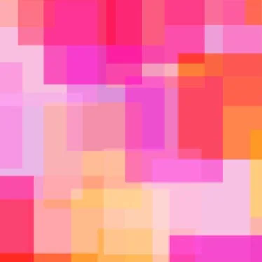
Obviously there’s some differences between the two but both were completely computer generated and both are basically abstract. It’s just that the colorful one was all placed by hand, it’s balanced but not perfect, there are differences in the amount of overlap - areas that could be improved. What it does is give the eyes and the brain something to think about. While the paperclips, where the grid was also determined by the computer, once you’re done saying ‘Oh, paperclips!’ has nothing more to offer - except maybe to be some really cool desk drawer liners.

Trends may have a little something to do with it but overall I suspect the psychology of how we see is the real driving force. If I were to redo the paperclips I would add a second step of hand manipulation to move one or two out of perfect alignment. It’s definitely something I’m paying more attention to as new designs are developed.

Thoughts? What do you like about your favorite patterns?

Compliments for Complementary Colors?

Primary, secondary, and tertiary colors

Primary, secondary, and tertiary colors

It’s all about the color wheel

If you don’t remember from grade school science, complementary colors are color pairs directly opposite each other on the color wheel (red/green, violet/yellow and so on). Put together, each appears more vivid than it does on its own. For some people that’s all they need to know! Bring on the bright blue and orange - everywhere! For the rest of us though, a little zing in a sea of calm may be a bit harder to achieve. Here are a few other ways to use complementary colors.

1. Change the saturation

Not everything has to be dialed into pure, paintbox tones. Pastels (or darker shades) can still play off each other. Here is yellow and violet - but with a lot of white for a more Easter/Spring effect:

pastel complementary colors

2. Get color mixing for more sophisticated combinations

The color wheel, like the spectrum, is really infinite, limited only to the colors humans can see (about 7 million). Despite that you’ve probably not seen too many color wheels that go beyond the tertiary level (what I have at the top) due to space and layout. School lessons usually stick to just primary and secondary colors, figuring they’ve made their point and you have those color crayons. And like above if red and green are your thing you don’t need more. Dial it into blue-violet or yellow-green or even yellow-yellow-green and you’ll start to get some more unusual and interesting combinations. The math is still the same though. If you’re going to use yellow-yellow-green then you’ll need to pair it with violet-red-violet. Below is red-violet with yellow-green. The exact same shades as in the larger circles in the color wheel above.

tertiary complementary colors

3. Play with the balance of the two colors.

The simple design above has more red-violet than yellow-green. Compare that with below which has increased the amount of yellow-green.

balance of complementary colors

4. Add neutrals

The above are simple geometric designs created to get across a point (but if you love them, by all means let me know!) You can still use complementary colors in a more subtle and relaxed way. Here the red-violet moves up into the design and a whole lot of neutral (in this case white) is introduced.


Subtle complementary colors

It’s a totally different look, isn’t it? Whichever your favorite, I hope you’ve gotten a few ideas on how to use complementary colors to enhance your environment or your wardrobe. You can be subtle or bold, bright or subdued, it’s just a matter of letting the color wheel guide you.

Please share your thoughts and your favorite color combinations in the comments. I’d love to know what draws your eye the most.

Working With a Green Color Palette

It’s Not Easy Being Green

Green. It’s the most universally pleasing and yet one of the most challenging colors on the spectrum. We see green more easily than any other color.   Artificially, getting it on to fabric or dishes has historically been a nightmare as it is often chemically unstable and the color shifts over time. (One of the many reasons you still don’t see very many green cars on the road.) And yet, it is restful, relaxing, and generally a fabulous way to bring the outside in.

 So… with all the those shades of green that the human eye can detect you can see how there’s a lot of room for things to go slightly (or horribly) wrong aesthetically.  Here are a couple of simple tips to keep your green color palette on track.

Pick Your Favorite Nature Spot

Here’s a bit of Hawaii I captured with my camera and just some of the greens that are in the photograph

Here’s a bit of Hawaii I captured with my camera and just some of the greens that are in the photograph

  • If you are after a particular nature mood – tropical jungle, Scandinavian forest, Appalachian Spring, find an evocative photograph and stick to the colors in the picture. Mother Nature always gets her rooms right!

  • Keep strong prints and contrast colors to a bare minimum and focus on smaller designs and textures

  • Alternatively, limit patterns to a contrast color in the photograph (pink blooming trees for example) and go all out with a cherry blossom print that works with your theme.

What Kind of Green are You?

Not after a theme room? No problem, just stick to this basic separation of greens and you should do alright.

There is a huge range of green shades but like all colors on the spectrum it blends with adjacent colors – in the case of green, that means yellow on one end and blue on the other.  The majority of greens available on home goods or apparel fall pretty clearly into one end or the other. Olive greens on the yellow end:

A simple pattern of 4 shades of olive greens

A simple pattern of 4 shades of olive greens


And forest greens on the other:

The same pattern shifted to forest greens

The same pattern shifted to forest greens

 To confuse things, most  actual forests are shades of olive, but that’s not too important to remember.  Where you can easily get into trouble is mixing the two groups:

An unfortunate mix of yellow greens and blue greens

An unfortunate mix of yellow greens and blue greens

This one is two shades of olive and two shades of forest. It doesn’t work so great, does it?  Most people naturally fall into one or the other camp in terms of what they’re attracted to, maybe based on what era they were exposed to as a kid (the 60’s and 70’s were olive heavy (avocado carpet, anyone?) while the 80’s veered heavily into the blue side of green as did the 00’s with a grayed version.

If you’re shopping online you probably know that colors can vary a bit from what they look like on a screen. But they won’t be looking blueish green if they’re in the yellow green camp or vice versa (without someone doing some seriously bad Photoshop mucking).

 As you become more aware of greens you will probably begin to notice where things fall and be able to easily say no to something that’s not going to work. But it’s always a good idea to carry a photo or a small swatch of something that has the key color(s), like wrapping paper or fabric, if you’re going to be making big or highly visible purchases.

  I hope this gave you some useful ideas to add more green to your surroundings. Green is truly good for you!

If this was helpful please share with a friend…

6 Ways to Let Your Individual Style Shine Through and Get Noticed

If you’ve Marie Kondo’d your closet and now don’t have much to wear or your living room is looking a little bare, don’t fall back on bad habits! Here are six ways to put more of you out where people can see (and appreciate) it without succumbing to clutter.

The next chapter

snowdrops.jpg

I’ve spent the last six months seriously exploring pattern, surface design and related tools and techniques. Sitting down in January to do taxes means a hard look at what has made money and what hasn’t. It’s now time to get serious (but still play!)

So in that vein and knowing that some good things can’t be rushed. I’m working hard on the business end of things - really focusing on getting rid of those limiting thoughts and pushing through the noise of the Internet. I’ll be moving some things around and also really zooming in on my strengths - making more designs like the one above that combine my love or gardening with folk art. It’s simple, it’s abstract, and yet it was drawn from real life - a snowdrop picked just yesterday. Art is certainly subjective and yet there are ways to add value and not just more choices - that’s important too for this next phase of entrepreneurial greatness…

Solving my own design problems

raw room.jpg

Welcome to my upstairs living room aka the winter snug - a cozy room for watching TV or having a cup of tea while watching the snow fall over the meadow. It had been completely covered in floral wallpaper… now it’s bare and ready for its next incarnation.

But what to do? I’m planning to move my comfy loveseat up here - it just fits in the dormer. It already has two slipcovers - gray velvet for winter and seafoam linen for summer so any color scheme has to fit those in. So I’ve been making designs in a set color scheme to see what might work. Here are a few of the mock-ups:

snug v2.jpg
snug v1.jpg
snug v3.jpg

I’m still sitting on a final decision but I’ve had lots of fun making designs based on flowers in the garden and woodland - trying to bring a sense of the place inside the house…

Starting down a folk art path

I’m easily distracted. And I really love color and whimsy. I’m not sure what kicked it off, I think it might have been a Skillshare class but I’ve found myself obsessing over folk art florals and capturing my garden plants through that lens.

Here’s an example

cyclamen heart.png

I just want to keep making more, so I plan to devote some time over Christmas to just play and see what happens - with snowdrops, leaves, whatever takes my fancy.

Locally Inspired

Fiction writers are told to write the book they want to read rather than the one they think will sell. Trends can be a ticket to fame or the best way to get lost in a crowd. When it comes to design, I think the same dynamic applies. I certainly find trends to be an interesting dynamic and a way to add constraints to an open-ended brief. If you don’t have a color scheme in mind, why not explore the new ‘hot’ colors? You can always toss them and do something else if it’s not working.

I have a small upstairs room under renovation that I want to decorate with my own work - but having looked through what I’ve done so far, nothing seemed quite right. So I’ve embarked on a mini project - focusing on five main colors - to create designs drawn from my immediate surroundings and as potential candidates for this cozy little room. It will be the evening snug, the winter hidey-hole with an overstuffed love seat in the dormer, tv and good reading light.

Two of the five colors were dictated by existing upholstery/soft furnishings; seafoam green and gray, the remaining three were drawn from a purple glass vase, a fern and a green/white hydrangea in the front yard. I’m not ruling out white/black or shades and contrasting colors but these five form the main palette.

I want the room to feel like part of its surroundings so I’m focusing on designs that relate to the garden, woods, and landscape. So far I’ve done a simply hydrangea blossom and a fern design. I’m liking this direction and can’t wait to see where I end up!